
Jail Brake
TOLEDO, OHIO
Logo Design
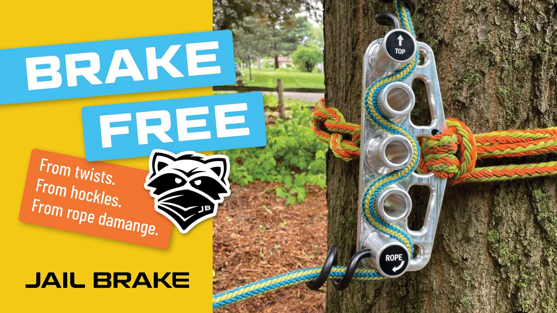
Arborists have one of the most dangerous jobs on the planet. Sure, we take our jobs seriously, but how many of us are hanging 100 feet up in the air while doing them? Well, Seth Ramsdell does… and he set out to better the industry by making it safer and quicker for his team.
While prototyping his invention, a friend walked into Seth’s garage and said “Man! What are you doing?! Looks like you’re trying to break out of jail!” That’s when the lightbulb clicked.
Jail Break was born.
Now that he had an innovative product that would take the arborist industry by storm, and a name to catch their attention, all Seth needed was a logo that captured Jail Break’s energy and told their story.
Originally Seth came to Forage to have a conversation around designing the Jail Brake’s instruction manual. After a little Forage curiosity and exploration, Seth’s sights set on re-branding his original logo to something that could carry them into the future. The initial logo, a prison watch tower, had alluded to the name, but wasn’t capturing WHO they were. We were honored to be the company he partnered with to rebrand and make a logo worth inking onto someone’s skin. Literally.
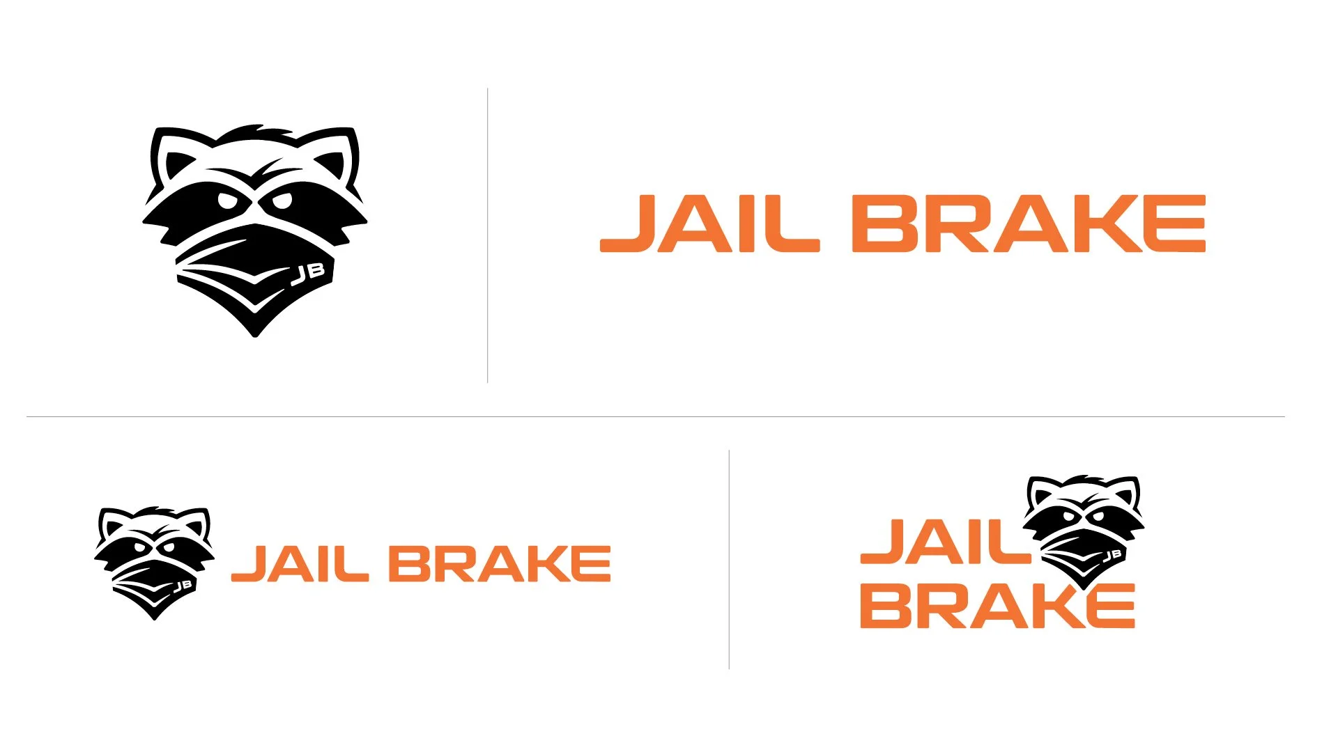
Forage wanted to create a branding package that would carry Jail Break into the future. First-round logo designs focused on trees, ropes and lowering… and a wildcard — a raccoon. The masked bandit spoke to Seth’s entrepreneurial spirit while giving an appropriate, and recognizable, woodland connection — and some attitude.
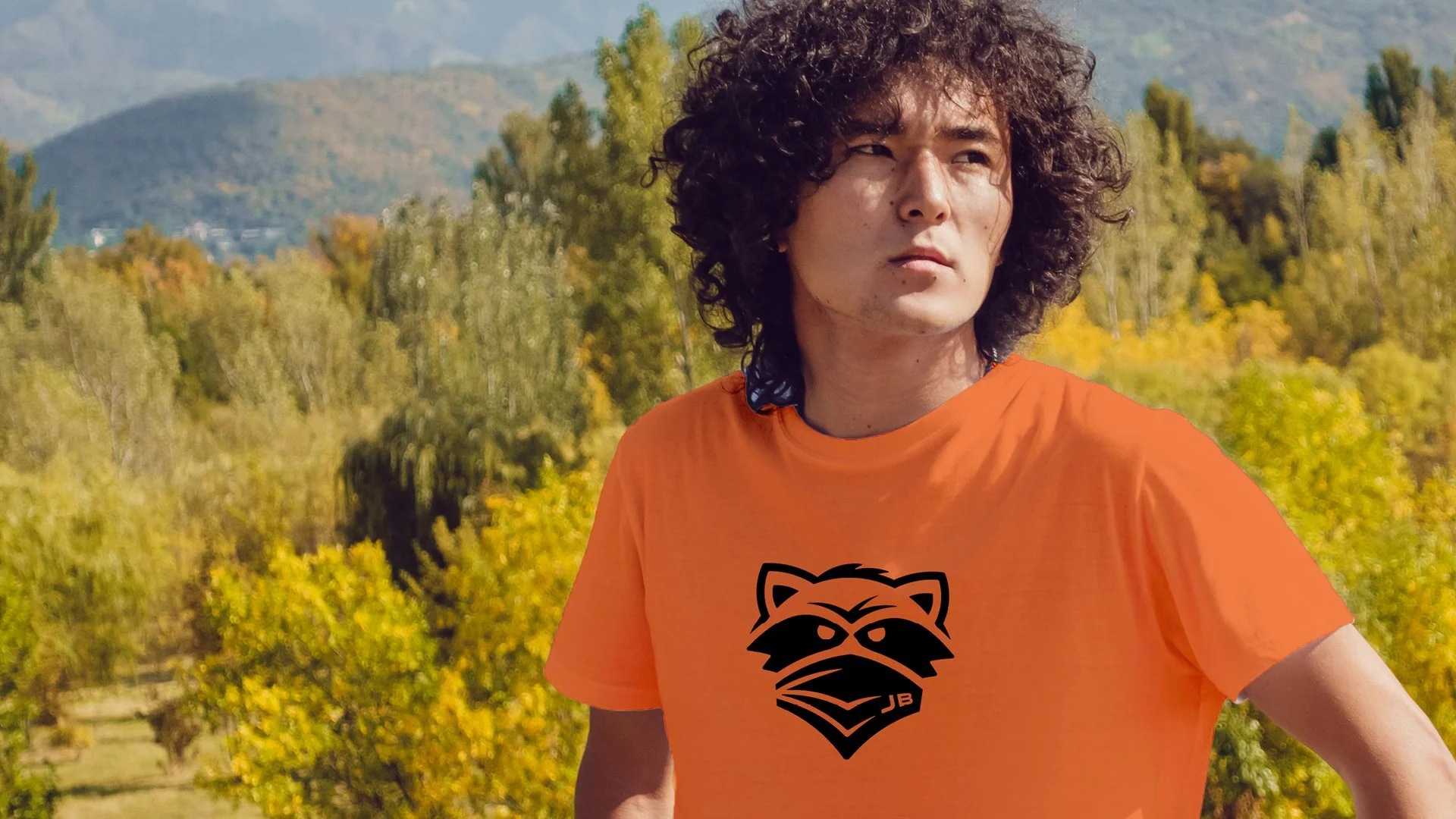
The icon is perfect for stickers (and tattoos) and is already receiving high-praise from Jail Brake’s biggest fans. After the icon was born, we moved on to the technical stuff and cranked out an instruction manual that was both informative and visually interesting to keep the reader’s attention.
"Thank you for translating my vague and indecisive requests into exactly what I didn't know that I wanted. We love them.” - Seth R. said of the finished product.
Happy to, friend. Keep on innovating! Check out Jail Brake in action here!