Experience Perrysburg
PERRYSBURG, OHIO
Logo/Brand Design
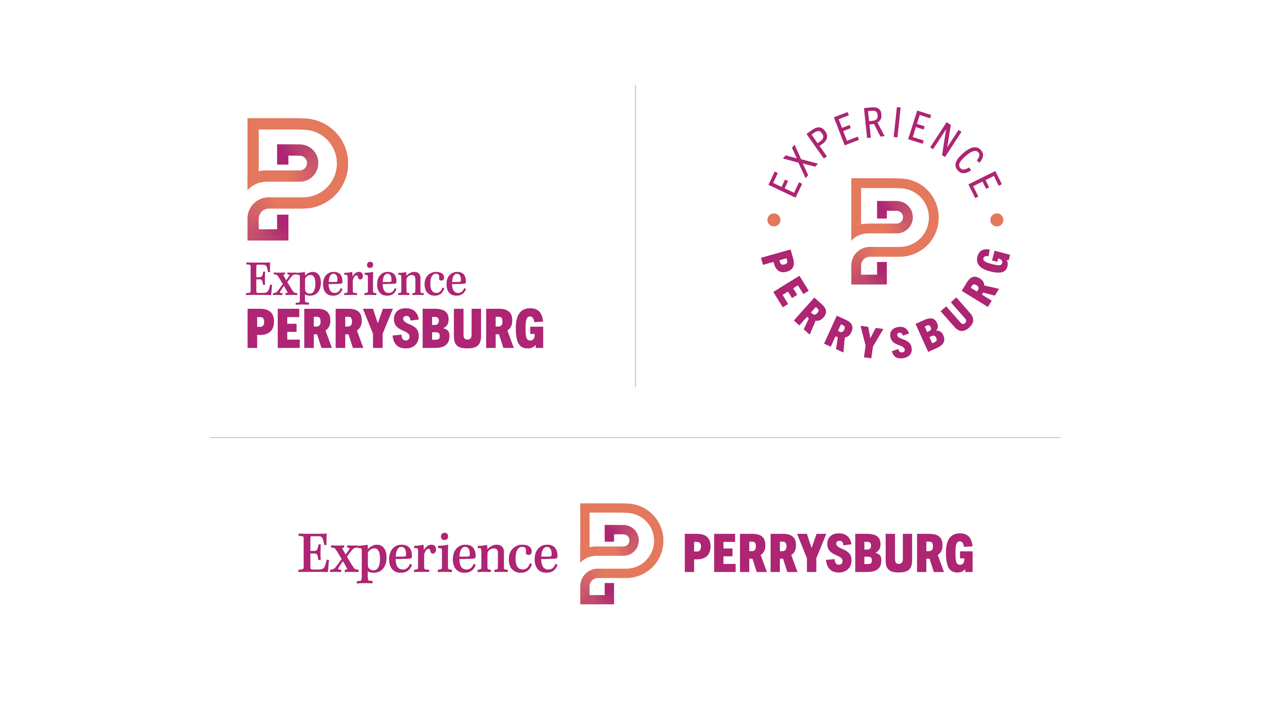
Nestled along the Maumee River, Perrysburg, Ohio is steeped in history and bustling with activity. Experience Perrysburg, the new destination marketing organization, came to Forage needing a logo system that would be flexible, long-lasting, and embraced by the community.
To understand what mattered to locals, we hosted a round table with the Experience Perrysburg team and community members and worked to both identify and simplify the overall feeling of Perrysburg.
Once we moved to design, the panel was drawn to “P” shapes for quick recognition, but also recognized there were several established P logos within the community. The ultimate solution was a refreshing twist on the letter, creating a “P” with originality and depth inspired by the panel's feeling of Perrysburg: connection and community.
The ripple in the “P” represents the Maumee River. While the singular, serpentine line represents the deep and continuous sense of community.
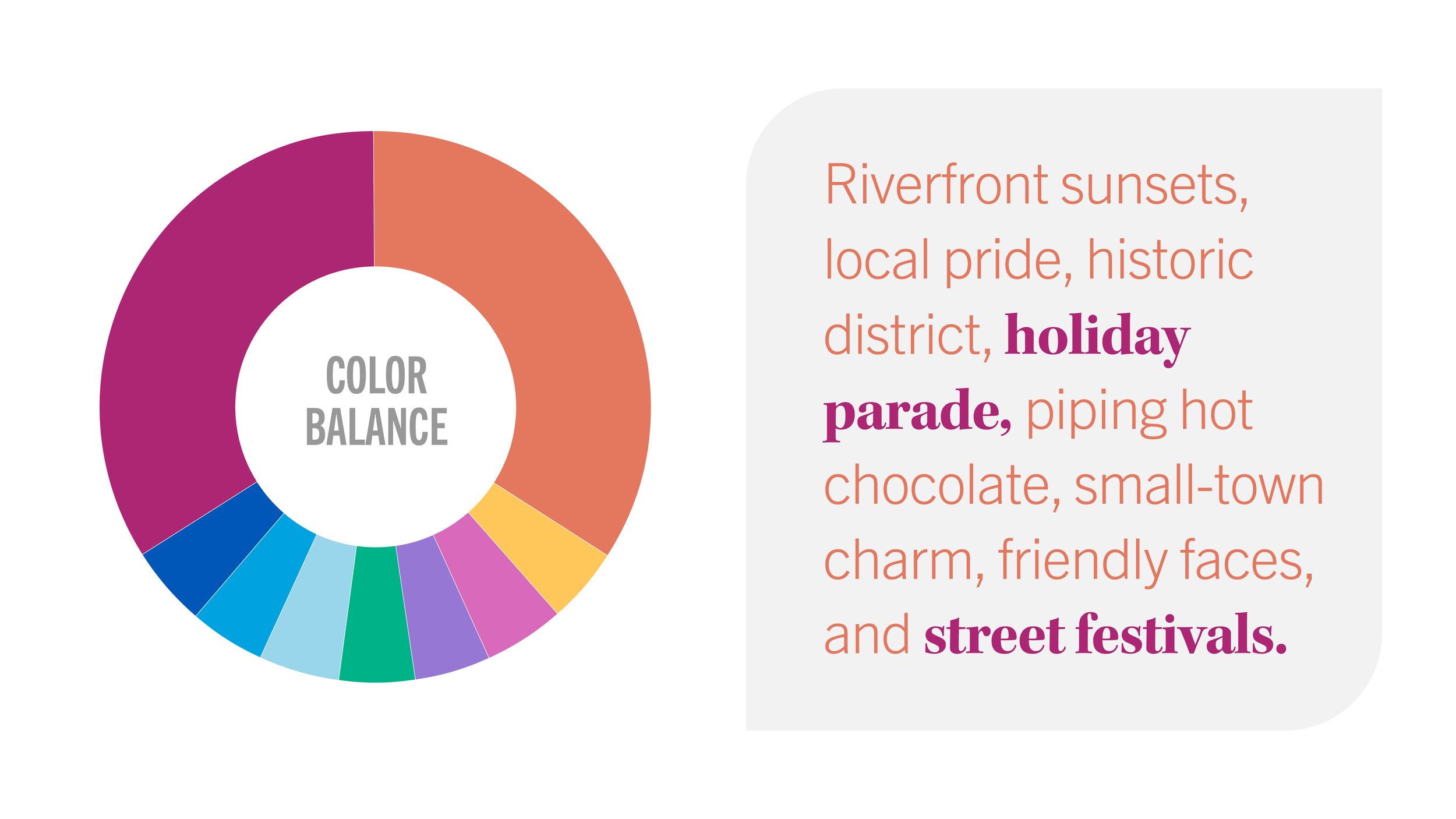
The final package gave Experience Perrysburg all the tools needed to uniformly promote across multiple platforms: various logo orientations, a logo system adaptable for future growth, a bright, energizing color palette, fonts, patterns, and visual elements. Because at the end of the day, Forage wants our clients to feel empowered and in control of their marketing, not held hostage.

Challenge: Create a logo that generates energy and excitement for community events.
Results: A new logo and brand that were instantly put into use.